Spring Entertaining: Tablescape Styling {plus tips}

Spring and Easter Tablescape by ConfettiStyle

One of my favorite color combinations is black and white with pops of bold color.  It’s a classic statement with an edgy vibe and I love the energy that these colors create when used together.  And it’s the perfect color statement for spring entertaining.

To celebrate the first day of spring, I pulled together a bold and bright spring entertaining tablescape to share with you.  And I added a couple of Easter elements in too since Easter is just a few weeks away.

SPRING ENTERTAINING:  BOLD & BRIGHT

Spring and Easter Tablescape by ConfettiStyle

Spring is the season when trees are blooming and flowers are budding so I created a beautiful flower arrangement as the centerpiece for my table.  I used this gorgeous yellow chinoiserie planter that I scored at an estate sale and filled it with a mix flowers from Trader Joe’s.

Flower Arranging Tip:  Use florist’s foam to keep flowers in place and constantly hydrated so they last longer. Soak the foam for 15 minutes before cutting it to fit the container. Water the foam every couple of days.

Spring and Easter Tablescape by ConfettiStyle

Spring and Easter Tablescape by ConfettiStyle

Spring and Easter Tablescape by ConfettiStyle

Tablescape Styling Tip:  Creating contrast is a great way to give your tablescape dimension and depth.  Combine colors that are opposite on the color wheel; mix matte and shiny finishes; use a variety of patterns for visual interest.


Spring and Easter Tablescape by ConfettiStyle

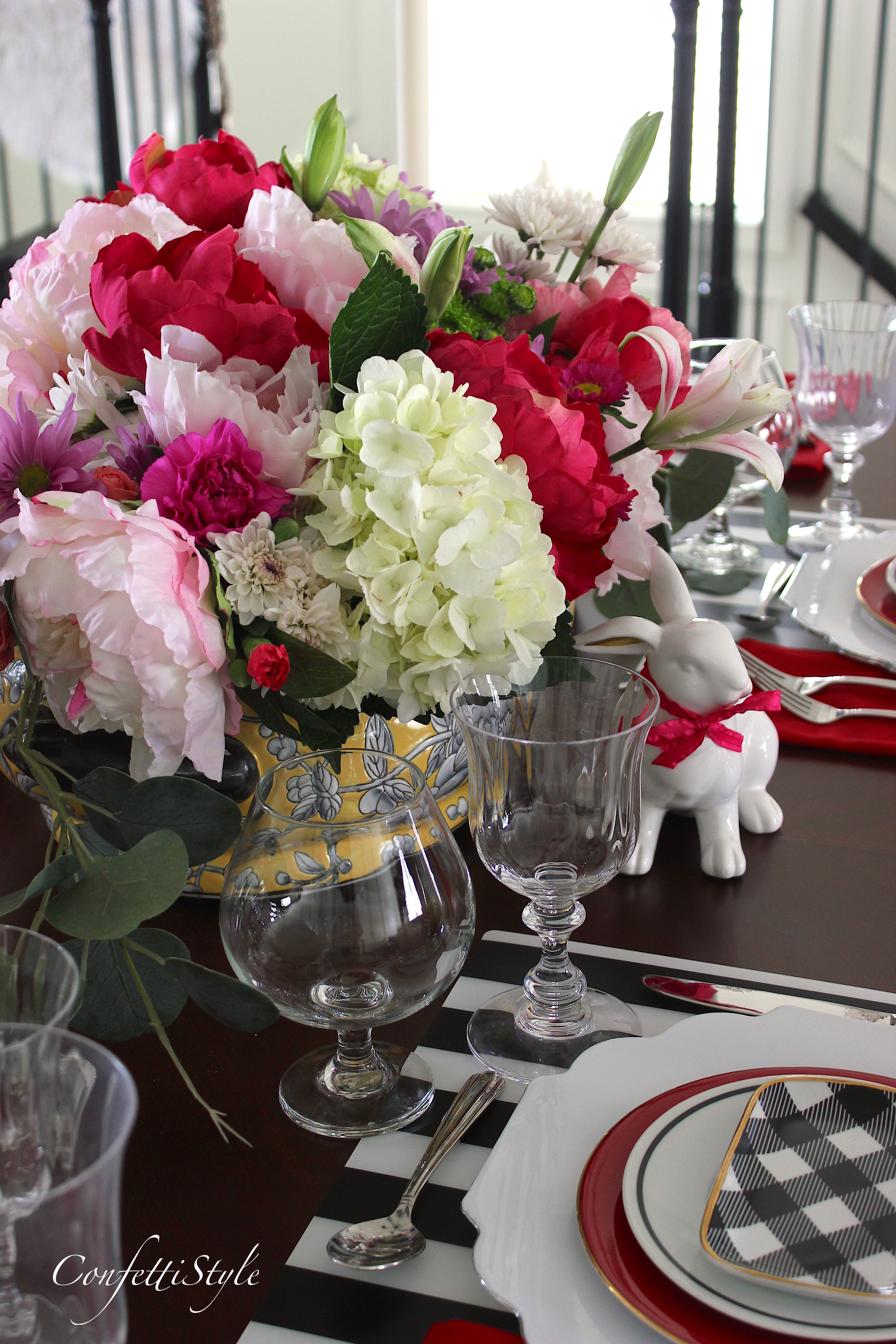
I know I’ve said it over and over, but one of the key elements of a beautiful table is the layering.  I layered different plate styles to give the table a  ‘collected’ but elegant look.  And the black and white striped placemats add a modern and dramatic edge.  Instead of using colorful glassware that would have competed with the flowers, I used clear crystal to add a touch of sparkle.

** I’ll let you in on a little secret.  Those beautiful scalloped white dinner plates with the silver rim are actually plastic!  Don’t they look amazing?  Until you pick them up you have no idea they aren’t real china.   If you want to pick up a set, I found them at Tuesday Morning.

Spring and Easter Tablescape by ConfettiStyle

I layered each pacesetting with my thrifted red salad plates and black and white accent pieces.  The small rectangular black and white plates came from C. Wonder (I miss that store) and I got the black and white bowls through a trade resource.  My red diy monogram dinner napkins  add yet another pop of color.

Tablescape Styling Tip:  don’t be afraid to mix different materials in creating your pacesetting.  There are tons of beautiful melamine plates at HomeGoods and they can make a great layering element when combined with china.

Spring and Easter Tablescape by ConfettiStyle

Whenever I create a tablescape, I like to use candles as part of the centerpiece statement.  The tall crystal candlesticks are from Tiffany’s and were a gift when I left Eddie Bauer to move to Atlanta.  They add height and along with the stemware give that table some shine and shimmer.

Spring and Easter Tablescape by ConfettiStyle

Spring and Easter Tablescape by ConfettiStyle

I shared my newly upholstered round ottomans on IG and love the way they coordinate with the centerpiece on the table.  The floral fabric is one of my all-time favorite budget fabric finds.  You can purchase it here and you won’t believe the price.

Spring and Easter Tablescape by ConfettiStyle

Spring and Easter Tablescape by ConfettiStyle

Spring and Easter Tablescape by ConfettiStyle

To give the table a nod to Easter, I nestled two ceramic bunnies on each side of the centerpiece and tied a pink bow around their next.  The bunnies were a Target dollar spot find from last year.

Spring and Easter Tablescape by ConfettiStyle

Spring and Easter Tablescape by ConfettiStyle

Spring and Easter Tablescape by ConfettiStyle

Spring and Easter Tablescape by ConfettiStyle

Spring and Easter Tablescape by ConfettiStyle

 Spring and Easter Entertaining Tablescape by ConfettiStyle


There you have it–lots of spring tablescape inspiration, and a few styling tips to help you pull your table together.

Cheers to spring and happy entertaining!

Spring Pillows { plus tips on building a pillow assortment}

Can you believe the weather that’s going on around the country?  One day is balmy and the next it freezing or snow is falling.  We are experiencing some frigid temps here in Atlanta and it only has me craving spring even more. Although I’m still working on decorating our house I’m working on infusing a touch of spring decor where I can.

One of the decor changes I like to make when the seasons change is to switch out my pillows.  It’s quick, inexpensive and new pillows just have a way of making an entire room feel fresh and new.

I’ve spotted lots a beautiful pillows in HomeGoods lately and have also found some great pieces online.  Here’s my  roundup of favorite Spring Pillows–all under $50!


Shop these faves:

Fringe (available in 3 colors) // Crewel Spliced  // Palm Leaf // Floral Velvet (available in 3 colors)

Shobori Velvet (hot trend!!// Jacquard Weave (available in 3 colors) // Cotton Throw (under $35) // Blue Marble Velvet

********

Aren’t all of these pillows just gorgeous?  The spring pillow trends are all about intricate details, lush textures, beautiful patterns and luscious colors. All of these design details make decorating so much fun.

If you’re looking to change-up your pillow game for spring, here are a few tips to keep in mind when planning an arrangement for your sofa…

PILLOW PAIRING INSPIRATION

Bring on spring!

How To Incorporate Black Into Your Decor


I’ve shared on the blog before that I’m pretty flexible when it comes to design.  For the most part I believe that if you love something and it feels right then it’s right for your decor.  On the flip side, there are some tried-and-true design rules that whole-heartedly believe in and feel should be a part of every good room design.

One of those design rules is Every Room Needs A Touch Of Black. In 2016 I created a Design Guide all about this rule and even shared my favorite black paint colors.  As a follow-up to that design guide, today I want to share a few tips on the best ways to incorporate this color into your decor.

source

 ♦  Black is a classic color that will never go out of style. And because black is made up of all colors, it’s a universal color that pairs beautifully with any color hue. There is simply not a color scheme that doesn’t benefit from the presence of black.♦

source


How To Incorporate Black Into Your Decor

♦   Accessorize With Black–Even though the color has a lot of depth, it is considered a ‘neutral’ so don’t be afraid to use it as an accent in a room that has little color.

  • A black decorative accessory or one with a black detail is the easiest way to subtly infuse the color into your decor.    Think bookends, pillows, a chandelier or a sculptural object.
  • Dark picture frames against a light-colored wall will draw the eye in while allowing the artwork within the frame to stand out.
  • A black lampshade instantly upgrades the elegance of a table or floor lamp.
  • For a dramatic statement in your living room or foyer, consider a black rug which will visually anchor the space.


source

source

Elle Decor

♦  Decorate Around Black–Incorporating a black furniture piece into a living space adds substance, depth and helps to ground the entire furniture grouping.

  •  An armoire, side table or an accent chair are three great black furniture options to consider.
  • Painting your interior doors black is a quick and inexpensive way to add a bold statement of black within your decor.  Go with a semi-gloss finish so the doors with have a reflective nature and any details will stand out.

 tip:  if the contrast of deep, rich black Is too much, look for a piece of furniture with an ebony stain (darkest brown with a hint of black undertones)–the impact will be the same.

source

source 

Decorating with Black

♦  Accent With Black-A black accent wall or painted ceiling is not only dramatic but one of the best ways to make a small space appear larger. Forget what you might have heard about painting a small room in a light shade. In actuality, dark rooms feel larger because the room lines disappear. Black also makes details come to life, colors more vibrant and patterns pop.

Decorating with Black

source

Decorating with black

source

Now that you know how to add black within your decor its time to go shopping. Here are a few budget-friendly accessories that I’m currently loving.


Black Decorative Accessories


SHOP MY FAVORITE BLACK DECOR PIECES

Garden stools are a good accent piece next to a chair or sofa and look great tucked under a console table.   I love this style and glossy finish on this shaped ceramic garden stool. {affiliate link}

This black and cream rug would look great in a bedroom, foyer or as a runner down a hallway.

I can just envision a lush green plant or beautiful orchid  in this gold banded leather vase. 

I love the lines and classic shape of this white lamp from Target.  A pair of these would look great in a bedroom or on a buffet in a dining room.

Isn’t this botanical art from Minted just beautiful?  The bold color against the dark background give it a little bit of an edgy feel.

Buffalo checks seem to be a big trend in home decor right now.  This plaid armchair would be a fun accent in a living space or bedroom.

You can never go wrong adding a decorative box to your decor.  I love this decorative box with agate stone as part of a coffee table arrangement.

I hope the tips and inspiration I shared today gives you some ideas on how to use black to enhance your decor.


New House Diary: Master Bedroom Design Plan

New House Diary--Master Bedroom Design Plan by ConfettiStyle

Hi friends.  I’ve decided to start a new series here on the blog called New House Diary.  The new series document the decorating journey of our new home.  I’ll be sharing the design plans as well as before and after photos so you can see the spaces come to life.  I’ve already shared the design plans for the office  and the living room and today I’m sharing the plans for our master bedroom.

We’ve been in the house for two months and are moving at a snail’s pace when it comes to decorating.  We have yet to hang artwork or curtains and we’re still waiting for our new sofa to arrive.  Fingers crossed it will be here next week!

When we moved, I made the decision to take my time decorating. That decision has been both good and bad.  The downside is that we’re still unloading boxes and trying to get closets, cabinets and drawers organized.  The positive thing is that taking my time is helping me make the right design decisions.

Here’s a look at our master bedroom the day we closed on the house.  The carpet was in desperate need of replacing and the paint colors were not at all appealing to me.

New House Diary--Master Bedroom Design Plan by ConfettiStyle

The bedroom is a good size but there aren’t many options when it comes to arranging the furniture.

New House Diary--Master Bedroom Design Plan by ConfettiStyle

Here’s the space plan for the room…

New House Diary--Master Bedroom Design Plan by ConfettiStyle


I want for the room to have a calm, sophisticated and warm look and feel so that’s what inspired the colors and design plan.

The walls are painted a soft grey, Whisper by Benjamin Moore and I absolutely love the color. All of the trim is BM Simply White (semi-gloss) and the doors are BM Black Satin also in semi-gloss.  I’ll be introducing darker grey through some of the accent fabrics the fabrics which will give the space more depth.

New House Diary--Master Bedroom Design Plan by ConfettiStyle

We already own most of the furniture for the room but are purchasing a couple of new pieces to complete the space. And I’ve got new linens and decor on my shopping list too.

Master Bedroom Design Plan…


New House Diary--Master Bedroom Design Plan by ConfettiStyleTo add dimension and visual interest to the neutral color palette, I’ll use patterned pillows and textured linens. The neutral foundation will also make it easy to  change the look seasonally, adding more color during the warmer months.

The plan is for velvet curtains and to use velvet on a bench that I’m having recovered.  Brass lighting will add a touch of shine and glam within the room.  I have one vintage brass lamp that I want to use on the nightstand and I’m hoping to luck upon a matching one at an antique or thrift store.

 The pillows patterns I’m showing are the general direction that I want to go, using a plaid, floral and animal print together.


New House Diary--Master Bedroom Design Plan by ConfettiStyle


I’m planning to have our bedroom complete before Thanksgiving so stay tuned for the reveal.


Black Nightstand 

Black Undredal Dresser (I’m planning to change our the drawer hardware)

Washed Percale Waffle Duvet Cover (also available in grey)

Charcoal Grey Plaid Pillow

Schumacher Linen Leopard Animal Print Pillow

Schumacher Pyne Hollyhock Pillow

Brass Chandelier

Charcoal Curtain Panels

Decorative Trim (similar here)

Upholstered Bench (I’ll be recovering one I already own)

Vintage Brass Lamp (similar here)

Medallion Rug

Caliente-Benjamin Moore 2018 Color Of The Year

Benjamin Moore 2018 Color Of The Year--Caliente Red AF-290


This is the time of year when we start seeing color and design predictions for the coming year.  Following a year of in-depth research and culling through thousands of colors, Benjamin Moore has picked a bold, dynamic red called Caliente.

Benjamin Moore 2018 Color Of The Year--Caliente Red AF-290


Ellen O’Neill, Director of Strategic Design Intelligence for BM describes Caliente like this…

” Strong, radiant and full of energy, Caliente AF-290 is total confidence.  It is pleasing, passionate and makes people feel special, like “red carpet treatment’!

And used these words that evoke the emotion of Caliente…

Benjamin Moore 2018 Color Of The Year--Caliente Red AF-290

Benjamin Moore 2018 Color Of The Year--Caliente Red AF-290

Back in the 90’s red was the go-to hue for dining rooms and occasionally used in a bedroom.  Today, power colors are trending which makes Caliente perfect for any room in the house.

Benjamin Moore 2018 Color Of The Year--Caliente Red AF-290

Benjamin Moore 2018 Color Of The Year--Caliente Red AF-290

I love red on an exterior door.  What a way to make a first impression!

Benjamin Moore 2018 Color Of The Year--Caliente Red AF-290

Here are a few tips to keep in mind if you’re considering decorating with Caliente or other bold hues:

  1. Determine whether you can commit to using an intense color in your home and just how much you want the tone represented.  If you determine that an entire room painted in a  bold statement would be too much, use it in a smaller space like a powder room, office or hallway.  For dramatic impact with even less commitment, try painting an accent wall in your favorite bold hue.
  2. Consider the lighting in the room.  Rooms with lots of natural light can handle a bold color more effectively than dark spaces.  Natural light can amplify the room without feeling overpowering.  Darker space with bold colors can feel more dramatic and moody.
  3. Contrast a bold color with a crisp white trim.  Bright white will intensify bold colors and make them pop which providing a string contrast.
  4. Once you select your bold color statement, make sure to incorporate accent pieces in the room that create a cohesive color statement.  Artwork, rug and pillows that incorporate your color choice will tie the rooms’ design together.

I couldn’t be more thrilled about Benjamin Moore’s selection since red happens to be my favorite color.  Even though I didn’t have red as part of the decor plan for our new house, I’m now rethinking that.  To learn more insight on how Benjamin Moore selected Caliente, check out this video they created.

Benjamin Moore 2018 Color Of The Year–Caliente


Color Crush: Decorating With Yellow

Color Crush: Yellow

Cheers to another week friends!  Did you have a great weekend?  I was ripping and running on Saturday and had a much needed day of relaxation Sunday.  I’m ready to hit the ground running this week and tackle my long to-do list.

I’m popping in today to share some colorful design inspiration with you.

I’ve also love the color yellow and have used it in my decor over the years but I’ve found myself gravitating toward it more recently.  As I’ve been working on design projects and looking to change our some pillows in my own home, this is the color I’ve been seeking.

My love for yellow runs the gamut from bright and sunny to deep, rich amber tones.  I love the soft and pretty shades as much as the warmer tones.

Yellow is one of those colors that mixes well with other colors and it also feels right at home with silver or gold finishes.

DECORATING WITH YELLOW

Color Crush: Yellow

source 

A pop of yellow adds an instant dose of cheer and vibrancy to room and just a small statement goes a long way in making an impact.

Color Crush: Yellow

source   

A brighter shade of yellow can be a good choice for an accent piece of furniture.  Against white walls, the color looks fresh and modern and against a dark wall the color feels dramatic and sophisticated.

Color Crush: Yellow

source

Yellow has been a color used in traditional decor for decades and will be around for decades to come.

Color Crush: Yellow

source

If you’ve been reading my blog for a while you know I love a colorful sofa.  Next to emerald green, a yellow sofa is on my design wish list.  I love the look of the sofa below against the soft grey built-in cabinets.

Color Crush: Yellow

source

And in a sunroom, yellow is the perfect color to pair with neutrals and white for a relaxing and polished feel.

Color Crush: Yellow

source

And kitchens are one of my favorite places for the color yellow.  The yellow cushions on this banquet seating add so much life and energy to an all-white kitchen.

Color Crush: Yellow

source

If you like bold statements, why not a yellow oven or a statement piece of art to punctuate the room?

fyi–artwork by Bobbi Burgers

Color Crush: Yellow

source

Since painting interior doors and accent color is such a big trend, yellow is definitely a fun way to add an unexpected pop in the kitchen.

Color Crush: Yellow

source

As with all paint colors, selecting the right shade for your decor is key.  To help you out, I’ve rounded-up six of my favorite yellow hues with suggestions on where I’d use the color when decorating.

Color Crush: Yellow

Happy decorating!

Home Tour | Interior Designer Jessica Buckley

I was scrolling through the Apartment Therapy site and stumbled across a home tour they featured in Edinburgh, Scotland.  The home, owned by interior designer Jessica Buckley has to be one of the prettiest homes I’ve seen in a long time.  

Jessica’s style is fresh and modern with classic elements and just the right amount of feminine details.    With an apparent love for color you can see that she has used color on the walls as a way to define each room within her home.  The blue grass cloth on the walls in the living room is dramatic but not overwhelming.  I love the depth and texture it has against all of the white mouldings and trim work.  Another fun aspect to Jessica’s home is her use of patterns and how expertly she has mixed and matched them.  The paring of black and white with a bold floral in the kitchen is an ideal accent for the soft pink walls.  And the fabric drape over the guest bed is stately but modern.

Jessica is definitely one to watch and be inspired by.

HOME TOUR | JESSICA BUCKLEY

Home Tour of Interior Designer Jessica Buckley

Home Tour of Interior Designer Jessica Buckley

Home Tour of Interior Designer Jessica Buckley

Home Tour of Interior Designer Jessica Buckley

Home Tour of Interior Designer Jessica Buckley

You can view Jessica’s design portfolio here. And check out her delightful blog here.

all images via Apartment Therapy

Fabric Shopping (and what it says about home decor trends)

I discovered a new fabric warehouse the other day and all I can say is WOW!  Before I entered the showroom the customer service rep warned me that there was a lot of fabric behind those doors.   Man oh man was she right.

Walking through those doors was like walking in a fabric wonderland. There were rolls of fabric, stacks of fabrics, hanging fabric and more remnant fabrics than the eye could see.

As I walked the aisles, I began to take note of the colors and patterns I was seeing so I’m sharing that with you today.

FABRIC & HOME DECOR TRENDS

MAD FOR PLAID–Large buffalo plaids appear to be a pattern that is gaining in popularity.  Where you once just saw classic colors like red, navy and black you’re now seeing plaids in every color and every size scale.

Fabric Shopping--Pattern Trends

Fabric Shopping--Pattern Trends

Cotton blend plaids have a more causal feel to them and so I prefer linen blends which have more texture and dimension. Plaid patterns are ideal for window treatments, pillows and furnishings as you’ll see in these inspirational images…

source

via 

via

MELLOW YELLOW–Pantone identified Primrose Yellow as one of the trending colors for 2017 and while I didn’t see a lot of bold yellow fabrics, I did see lots of soft yellow.

Most of the fabrics in the yellow color family were traditional floral or geometric designs perfect for upholstery, drapes of bed linens.

Fabric Shopping--Pattern Trends

Fabric Shopping--Pattern Trends

image source

SHADES OF BLUE–With the popularity of blue and white decor it’s no surprise that there are lots of blue and white fabric patterns on the market right now.  I spotted florals and well as more modern geometric and boho inspired designs and the color palette ranged from deep navy to shades of teal.

Fabric Shopping--Pattern Trends

via

source

Fabric Shopping--Pattern Trends

Fabric Shopping--Pattern Trends

FLOWER POWER–Bold floral motifs are a trend that forecasters identified for 2017 and the fabrics I saw supported that.  From tiny prints to large oversized designs, feminine florals have a fresh, modern feel.

Fabric Shopping--Pattern Trends

Fabric Shopping--Pattern Trends

I love the look of this antique, washed-out floral fabric.

Fabric Shopping--Pattern Trends

Fabric Shopping--Pattern Trends

The mum design was bold and had lots of texture and dimension.  I could envision this on club chairs or an ottoman.

Fabric Shopping--Pattern Trends

image source

BLACK & WHITE--Never will I tire of black and white patterns.  Black and white are a classic color combo and pairs well with anything you put with it.  The white with black plaid at the top would look great made up in pillows.

Fabric Shopping--Pattern Trends

via

50 SHADES OF GRAY– Many of you may want to see the grey color trend go away but I think it will be around for a while.  Grey is a great way to introduce color into your decor when you don’t want to go all white but want a little color.

I also noticed lots of fabrics that combined grey and soft teal which is always a pretty palette.

Fabric Shopping--Pattern Trends

via

PRETTY IN PINK-The pink fabric aisle was one of my favorites.  Instead of looking like fabrics for a baby’s room, the patterns looked modern and updated.  The second fabric down was gorgeous and you know I love the animal print.

Fabric Shopping--Pattern Trends

soruce

I snapped a lot more pictures but the visual eye candy has to end sometimes, right?

Finding the perfect fabric is key to a beautiful space and I’m so glad it’s something I get to do as part of my job.

p.s.  I’d love to know which of the fabrics I spotted grabbed your heart!

Happy Friday, friends.


Copyright © 2024 · Theme by 17th Avenue

Copyright © 2024 · Amelia on Genesis Framework · WordPress · Log in