Design Chat: Accessorizing Bookshelves and adding the finishing touches

I received an email from one of my blog reader, Megan who was looking for help with the wall decor and accessorizing the built-in bookshelves in her family room. The bookshelves and the walls have been empty for 3 years and Megan doesn’t know where to start with a decorating plan. She is also struggling with the sofa, which she’s not a fan of but others in the family are.

Here’s a look at Megan’s family room…

Design Chat--Accessorizing Bookshelves and Decorating Tips by ConfettiStyle

Design Chat--Accessorizing Bookshelves and Decorating Tips by ConfettiStyle

Design Chat--Accessorizing Bookshelves and Decorating Tips by ConfettiStyle

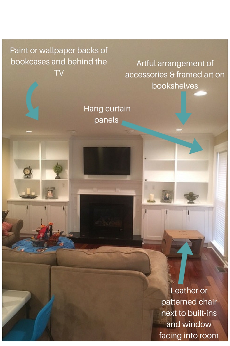
And here’s my design vision for Megan’s room…

THE COLOR PALETTE

******************************

The tan sofa, beige walls and white built-in shelves create a neutral color foundation for the room.  The area rug has different tones of red, browns and green in it so that should be the jumping off point for accessorizing the rest of the room.

Design Chat--Accessorizing Bookshelves and Decorating Tips by ConfettiStyle

The expanse of white shelving surrounding the TV needs a major pop of personality.  Beyond getting the right mix of accessories, I recommend that Megan either paint the backs of the bookshelves in an accent color or cover the backs with a grass cloth wallpaper.  Wallpaper would achieve two things–1) color and 2) visual texture which would really enhance the space.

When painting the backs of bookshelves, I usually recommend that you go a shade or two light or darker than your wall color.Design Chat--Accessorizing Bookshelves and Decorating Tips by ConfettiStyle

ACCESSORIZING

*****************************

When it comes to decorating bookshelves, the items you decorate with are just as important as how you arrange them. Here are a few tips on accessorizing bookshelves and a graphic with accessory groupings that always work.

  1. Create depth ‘top to bottom’ and ‘front to back’.  Arrange items so the pieces are not at the same level or position of the shelf.  Your accessories should feel layered and not uniform.
  2. Vary the size, scale and shape of your accessories.  Decorate with a variety of items to create visually interesting arrangements.  And also keep in mind that if your shelves are adjustable you can create wider openings which will allow for larger decorative pieces.
  3. Create balance from shelf to shelf and side to side.  As you arrange items, step back to make sure the overall look of each shelf and each side of the fireplace feels balanced.
For more bookcase decorating tips, read my post 5 Ways To Style Your Bookcase.

Design Chat--Accessorizing Bookshelves and Decorating Tips by ConfettiStyle

WALL DECOR & SOFA STYLING

**********************************************

Wall decor is one of the most important elements of accessorizing a room.  In many cases your wall decor will serve as the focal point for the room.  In Megan’s room, the wall decor will provide a dominate impact statement within the room so it needs to be dynamic.

I recommend a large piece of artwork flanked by starburst mirrors for the most visible wall in the family room.  A piece of art will add color and draw you in to the room.  Mirrors will add a graphic detail and enhance the light coming in from the opposite window.

To enhance the sofa, Megan should add accent pillows and a small-scale bent arm floor lamp at the end of the sectional providing much-needed task lighting.

Design Chat--Accessorizing Bookshelves and Decorating Tips by ConfettiStyle

FUNCTIONAL DECOR

*******************************

The other decorative items I’d recommend is a console table behind the sofa, an accent chair near the built-ins and curtain panels for the windows.

 A console table will visually extend the partial wall behind the sofa and create an additional surface for a lamp and accessories.

The accent chair will provide additional seating and create a more balance space, filling the now empty corner.

Curtain panels will add softness and another pattern element within the room.

Design Chat--Accessorizing Bookshelves and Decorating Tips by ConfettiStyle

THE LOOK

**********************

Unique accessories and colorful wall decor is all that is needed to bring Megan’s room to life.

Design Chat--Accessorizing Bookshelves and Decorating Tips by ConfettiStyle

Design Chat--Accessorizing Bookshelves and Decorating Tips by ConfettiStyle

Color Crush: Orange and GRAY (or is it Grey)

Color Crush:  ORANGE + GRAY

Orange and Grey via Design-Seeds

via

I popped into a few home decor stores over the weekend and after about the third store a color trend started to reveal itself.  It’s no surprise that with the coming of fall you’re beginning to see shades of orange in decorative accessories, linens and wall decor but what’s making orange feel fresh is a mix of gray. This quiet neutral has shaken off its bad rap. Gray has not only replaced beige as being the “It” neutral, but grays are now synonymous with style, sophistication and glamour.

Here are my three reasons for loving Orange + Gray…

1)  the combination is sophisticated but has a relaxed feel

2) the color combo is gender neutral and can work in just about every room of a home

3)  both orange and gray mix well with black, white and neutrals which makes these colors really versatile

♦♦♦

In the bedroom, orange and gray feels luxurious and rich.  A charcoal gray with slightly blue undertones lends a feeling of masculinity and the orange keeps the overall feeling energized and modern.

ORANGE AND GREY BEDROOM VIA BHG

via 

Don’t be afraid to mix shades of neutral and gray, Greige which can create a really dynamic colors palette for decorating.  In this living room, a mix of grey, neutral and orange help to create depth and dimension.

Orange and Grey via En.paperblog

via 

I think orange and gray is a great color combo for a piece of hand painted furniture–business on the outside and party on the inside

Orange and Grey Desk via Etsy

via

Natural wood combined with orange and deep gray tones create a warm, rustic feel and the addition of black helps to ground the space and add a layer of dimension.

Orange and Grey Bedroom via BHG2

via 

I never would have imagined orange and gray in a floral arrangement but the colors are so beautiful together.  I’ll definitely be using this color combination for fall decorating.

Orange and Grey Floral Bouquet

via

Do you have a fall party of the calendar?  If so, consider orange and gray as the color palette and if it’s a Halloween party, just add black for a sophisticated twist on spooky decorating.

Orange and grey party via en.paperblog

via  

Orange and Grey via Dishfunctionaldesigns

via

Accents of crisp white give orange and medium shades of gray a modern, urban feel

Orange and Grey Living room via Macys

via  

and when lighter shades of gray are used as accents against a mostly white palette, the feeling is sophisticated and elegant.

Orange and Grey bedroom via MakerGifrl

via

Like white, selecting a gray paint color can be challenging.  Here are a few things to consider:

Shades of light gray have become a really popular paint color and is the perfect solution when a bit of color is desired but you still want to maintain a light, airy feel.  Many lighter shades of gray actually have a silver undertone which gives the color a bit of sheen under bright lights and adds a subtle glow to a room.  Lighter shades of gray will work in every room of the home and are one of my favorite colors for a bedroom, bathroom, home office or ceiling color.

♥  Medium shades of gray will add warmth and richness to a space without making it appear dark and dreary. Medium tones mix well with neutrals, black and wood tones are great to use in larger rooms to crate a cozy feel.

 You’ve probably heard the term Greige before and may not have realized what it meant.  Greige is a blend of gray and beige creating a warm neutral that is ideal to use in rooms with gold, bronze or brass accents.  Greige walls are also a nice alternative to traditional neutrals are ideal for a living room, family room or kitchen.

♥  Deep charcoal grays have a luxurious and elegant feel to them and are stunning when paired with white trim, jewel tones or primary colors.  Shades of charcoal are best in rooms that get lots of  natural sunlight which will prevent the room from feeling like a cave.

There are lots of opinions on the best gray paint colors but this round-up highlights my favorites:

GREY PAINT COLORS via HomeBunch

via

And, if you’ve ever wondered whether it’s GReY or GRaY here’s the scoop…

Gray (with an “A”) is the preferred choice in American English. 

Grey (with an “E”) is the preferred choice in British English. If you find yourself writing to a British audience in an English newspaper or magazine, grey is the word choice you will want to use.

So when it comes the Orange and Gray, does this color combo get a thumbs up or thumbs down?

Shelly

Copyright © 2024 · Theme by 17th Avenue

Copyright © 2024 · Amelia on Genesis Framework · WordPress · Log in