VARIETY IS THE SPICE OF LIFE

When it comes to decorating dining rooms, I am really against the matching table and chair set concept.  I think dining rooms are treasured spaces, where family and friends gather to share and create memories. And, being such a sacred space, I think dining rooms should boast an abundance of style and personality.

One of the looks that I am really into these days is a dining room where the dining chairs are a mix of styles and or finishes.  I think  this is a great way to jazz up your dining space and give it lots of character.   I just love the collection of chairs below, not only the different chair back styles but also the mix of fabrics.  Totally cute!

{source}

If you want to create an eclectic look in your dining room by mixing up your chair styles, there are several ways to do it….

1.  Create a statement with just the Host and Hostess chairs by using a different chair silhouette, and by upholstering the chairs in a bold fabric.  The colors used in this dining room are so fun and energetic.  I love the Chartreuse used on the parson chairs and the tufting really adds a lot of style.

 {source}

2.  Use a different color on a single chair style.  This look is great if your style is a bit more classic but you still desire a bit of whimsy.  These classic farm style chairs look more updated with painted finishes and contrasting fabric seats. 

{source}

 3.  For a more eclectic look, use a variety of chair styles but keep the finish consistent.  This look is very easy on the eye while still adding a lot of style punch.  I’d love to create this look around my kitchen table. 

{source}

How fun is this look?  The mix of chair styles gives this farm table so much more personality.

{source}

{source}

{source}

4.  For ultimate personality and character, go all out and combine upholstered chairs, wood chairs and benches.  Depending on the color scheme and chair styles, this look can be elegant and formal, or casual and comfortable. 

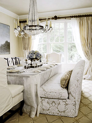
This is such a beautiful and elegant look. I adore the upholstered banquette combined with the open back black chairs.  So chic!

{source}

{source}


 If you’re looking to make a few changes to your dining room, spice it up a bit and  mix-and-match your chairs!  I know you love the look. I know you’ll love the look!


DESIGN CRUSH: REBECCA MOSES

OMG!  This is one of the most fabulous books I’ve come across in a long time. 

 Rebecca Moses, an icon in the fashion and home design business has penned her first book, A Life of Style, and it is brilliant. 

Combining beautiful watercolor illustrations with her fashion and interior design knowledge, provoking words of wisdom, and an abundance style savvy advice, Rebecca’s book really makes you think about how you express your personal style. 

  Within hours of opening the box, I began flipping the pages, absorbing every word and marking my favorite “words of wisdom” with post-its. 

In addition to learning a few new things about the world of design, I also walked away fully inspired to re-look and re-define my personal style.

Here are few of my favorite inspiring thoughts from Rebecca.  I think you’ll be inspired to.

 There Are No Rules In Style,  Just Good Instincts!

True Style I s Understanding Who We Are and Having the Conviction To Express It.

Style is Not Skin Deep.  It is Soul Deep.  It is Our Most Significant form of Expression.  It is How we Communicate Who we are to the World Around us.  It is a Reflection of Who We Are, Where We Have Come From, and What we want to SAY to the World Around Us!  IT IS OUR VOICE!

If you love design and fashion as much an I do, you’ll definitely want to add this book to your collection.  Enjoy!

until next time…

 all images via Rebecca Moses

ASID AWARD WINNERS

Every year, all across the country, the American Society of Interior Designers (ASID) awards outstanding interior designer projects with their Design Excellence Awards.  The designers here in Georgia really out did themselves this year, creating some of the most gorgeous spaces I’ve ever seen. 

While several of the winning design firms have long been established here in Atlanta, several of this years winners were new to the winner circle.  It is so exciting to see so much fresh, new talent making their way in the world of interior design. 

Here are my favorite winning designs.   Be sure to visit each designers website for more of their beautiful and inspiring work.


GOLD WINNER–Residence over 3,500 sq. feet    turnerdavisinteriors.com

GOLD WINNER–Residential Singular Space  peacedesign.org

GOLD WINNER–Model Home  robertgraysoninteriors.com

SILVER WINNER–Show House  carsonguest.com

GOLD WINNER–Historic Preservation   kittytuttleinteriors.com

SILVER WINNER–Residence under 3,500 sq. feet  elinorjonesinteriors.com

BRONZE WINNER–Model Home  howardhouseinc.com and ikaeinteriors.com

GOLD WINNER–Residential Singular  pineapplehouse.com

BRONZE WINNER–Kitchen and Bath   Sue Wislar Interiors

SILVER WINNER–Residential Singular  tduffyandassociates.com

SILVER WINNER–Residence over 3,500 sq. feet  rabautdesign.com

GOLD WINNER–Residence under 3,500 sq. feet  Cheryl Lucas Interior Design


 Photo Source:  Atlanta Homes and Lifestyles

TUFT LOVE

I just adore tufted furniture.  There is something so old school, yet modern about the look. 

Here are a few of my favorite pieces… 

{source}

I love how dining room chairs with tufted backs make a dining room feel softer and more glamorous.

{source}


When I’m in the market for a new piece of furniture, this chaise will be high on the list of considerations.  I love the lines and the tufted detail gives it a regal feel.

{source}

This tufted leather chair with its fabric back is so stylish.  I love the bold color and nailhead trim.

{source}


This tufted headboard is just beautiful.  

{source}

{source}

{source}

This tufted bead is so elegant and sophisticated.  Typically used just on the headboard, I love that the tufted treatment was also used on the footboard.  I just want to jump in this bed and take a little nap. 

{source}


This sofa is  pure luxury! 

{source}


 Do you love tufted furniture as much as I do?

MAGAZINES WORTH READING

Just when I thought I’d never see a new design magazine in print, along comes Anthology.

Anthology is a shelter and lifestyle magazine covering the worlds of home, decor, travel, design, entertaining and culture.  The first issue will be out in October, with quarterly distribution there after.  Despite that my mailbox probably can’t handle one more magazine, I can’t wait to get my hands on this new publication.  Check it all out here!

Anthology1

And, for all you die-hard design fans, make sure to check out Rue Magazine this Thursday (9/16), when the first issue goes live.  If the sneak peeks that have popped up in blogland are any indication, this is going to be one great mag.

Happy Reading!

MY NEW LOVE FOR CARPET

Are you a hardwood floor or carpet person?  Me, I love a little of both, but have become a bigger fan of carpet since I opened my eyes to modular carpet tiles.


 I’ve seen carpet squares being used on many of the design shows I watch on TV, but  I have always thought of them as an industrial option, lacking character.  Well, let me tell you I was wrong, wrong, wrong. This past weekend, I watched an episode of HGTV’s Design on a Dime, where they used carpet squares to dress up a dining room.  Wow… the look ever great and the cost was very reasonable. 


 That show really got me interested in carpet squares so I spent some time on the FLOR.com website.  This website is the mecca for beautiful and stylish carpet squares. 


I was so surprised to see all the color, texture and style options available.  And was even more thrilled to see that one of my design idols, Martha Stewart has developed a licensed program with them.   


Each of the carpet squares measures 19.7” sq and is made of renewable and recycled content, so they are earth friendly.  I love the ease involved in installing the squares and the multitude of design options available.  You can mix-and-match patterns to create your own custom look and create any size carpeting you need.  Flor tiles are the perfect companion to hardwood flooring, when you need a bit of softness under foot or some added texture and warmth for a space.  


Once the carpeting is down, if an area needs cleaning or replacing, you simply remove the one or two tiles needed and replace them with new tiles.  How brilliant!  

  Check out these designer looks you can create with Flor tiles.  


 After seeing all the beautiful carpet option available by Flor, all I can ask is where has FLOR.COM been all my life! 


Is a new carpet in your future?  If you have Flor tiles in your home, I’d love to see photos of your custom design.   

WHAT A LITTLE PAINT CAN DO

No longer is paint just for your walls and ceilings.  I spent the weekend flipping magazines, blogs and websites and came across some really cool painted floor designs.  Check out how these floors take the design of these rooms to a new level.

(image)


(image)

 This last image was a DYI project that the very talented Lori Dunbar from Fin and Roe and Marzipan Inc  completed in her home. If this inspires you to do a little painting of your own, check out Lori’s how-to instructions here!

Fabulous!


THE BRIGHT SIDE OF DESIGN

When it comes to decorating with color, bold, in-your-face color, I think that many people love the idea but just don’t know how to go about doing it.

Decorating with color can be tricky, but if done correctly, the results are fabulous.  If you want to add color to your home, here are a few simple design guidelines to keep in mind:

  1. FOLLOW THE 60-30-10 RULE.  Select the primary color you want represented in the room, which in most cases will be the wall color, and use that color so that it represent about 60% of the visual impact of the room.  Next, select your complementary color and use that color so that it represents about 30% of the visual impact.  In many case the complimentary color will come via your sofa, rug or larger accent pieces.  The last color statement you want to use is an accent color.  Your accent color should represent the last 10% of the visual impact and will most likely be added via accessories, pillows and artwork.

  2. CONSIDER THE COLOR VALUE. Color value is all about the depth of color you choose to use. It is light, dark or somewhere in between?  When selecting your color combinations (primary, complimentary and accent), make sure to use colors that not only work together but that will create a room that feels balanced.

  3. USE COLORS YOU LOVE.  I really think your home should be decorated in a way that makes it feel like an extension of you.  Everything you put into your home should make you feel comfortable, relaxed and at-ease, including the colors you decorate with.  If you use colors you love, you’ll create a palette that not only works together, but that makes you feel good. 

Check out these rooms, where color is the hero, and be inspired to add a little color to your decor!

  The pink walls are a definite statement in this space and the strawberry accent chair and pink toss pillow on the sofa tie it all together.

In a room with a more subdued color palette, a bright accent color can really bring it to  life.  The pumpkin colored chairs are a dramatic design statement and really set the tone of this room.  If you look closely, you’ll see hints of pumpkin in the wallpaper design.

 I love color in a bedroom.  The bedding and chair fabrics make a great pair.  The blue wall color is represented in the paisley bed cover, linking the two surfaces together.

 This space is a great representation of color value done right. All of the colors used are deep and rich, with the same depth of intensity.  I love how the green chairs pop against the carpet. 

 Sticking to a simple color statement can be just as impactful as using multiple colors.  Here various shades of Chartreuse green have been combined to give this space depth and dimension.  Hints of pink are represented in several spots on the table and shelves, and the off-white benches provide the perfect neutral touch.

 This 3 color design statement is bold and dynamic.  I love the combination of hot pink, chocolate-brown and ivory.  The adjoining room is painted a shade of green, which is the perfect complement to the pink tone.

 If color on the walls is not your thing, use color as the accent.  This room is successful because the bold accent colors have been spread around the space to make the room feel visually full and alive.

 I just adore a black and white color statement that is punched up with bold accent colors.  Framing  the chairs in the same creamy neutral as the table and wall stripe let the bold color of the chair seats and back really stand out .

 While it is often safer to go with a neutral sofa, a bold, colorful sofa can give your room all the personality it needs.

 Sometimes it’s best to make your color statement in a unique way.  The red frames on these chairs really bring this dining room to life and give this really simplistic table a new personality.  Do you see the red throw on the sofa in the adjoining room?  Repeating an accent color from one room to another is a great way to create flow between the spaces.

The orange accents used in this space was used in the right way.  Try repeating your accent color in 2 to 3 spots so that it creates rhythm within your room.

 If you have a favorite color you want to use everywhere, then make sure to use several shades of it to give the room some depth.  You can still apply the 6-30-10 rule, just using different shades of a single color.


What’s your favorite color to decorate with?

Photo source:  DecorPad (1,2,3,4,6,10,12), Beau Arts Maison (5), Kathryn M. Ireland (7), Ruthie Sommers (8), Camille Julner ( 9), House & Home (11), Lee Kleinhelters (13), House Beautiful (14)

Copyright © 2024 · Theme by 17th Avenue

Copyright © 2024 · Amelia on Genesis Framework · WordPress · Log in