The Fashion and Function of Settees

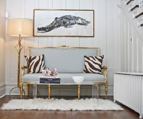
 One of my favorite pieces of furniture is the Settee.  Not only are Settees the fashionable but they provide function in so many home decor applications.

Pinned Image

via

The Settee is a perfect option for seating at the foot of a bed.  Because they are larger in scale than a chair they balance the weight of a bed and add visual impact within a bedroom.

Pinned Image

via

I love the idea of a Settee in a library or reading room.  It provides the perfect spot for lounging solo or sitting with someone special while reading.

Pinned Image

via

As an accent in a living room, Settees provide additional seating without overpowering a space. 

Pinned Image

via

Tucked in front of a mirror in a bedroom, hallway or pass through, a Settee adds the charm.  And, the Settee is the perfect piece of furniture upholstered in a statement piece of fabric.

Pinned Image

via

Replacing what would in most cases be a piece of furniture, a Settee keeps the space at the end of a foyer open and airy!

via Amie Corley Design

Tucked into those often neglected alcoves, a Settee makes this space come alive and purposeful!

Pinned Image

via

Even in a more contemporary styled room, a Settee can make a statement and complete the look.  I love the curved details of this Settee amongst all the square and rectangular pieces.

Pinned Image

via

One of my favorite applications for Settees is as an alternative to dining chairs. This dining space is so much more intimate and cozy with twin Settees.

Pinned Image

Image via Good Bones, Great Pieces book by mother, daughter author team Suzanne and Lauren McGrath! Available here!

In small rooms the Settee is a great alternative to a traditional sofa or grouping of chairs. 


If you’re looking to make changes in your decor or need to save on space, a Settee is a very practical and stylish option!


Thanks for stopping by today!
 

If you’d like help creating a home you absolutely love, CONTACT ME about my local design services or my Door-to-Door e-design service!

Room of The Week

While I’ve never really decorated in a blue and white theme, I’m always attracted to spaces utilizing this color combination.

What draws me to this space is of course the pop of yellow which gives the room a fresh, updated feel but also the combination of one blue and one white sofa.  The white sofa floats in front of the bay window with ease of comfort, allowing your eyes to move effortlessly the view. 

The blue sofa and opposite navy and white chairs anchor the sides of the room giving the all white space depth and visual weight. I love how the eclectic mix of patterns, some traditional and others abstract and modern brings out the personality of this room.

Traditional navy and white with a dose of  “happy” yellow.

So refreshing!


If you’d like help creating a home you absolutely love, CONTACT ME about our design services!


image via House Beautiful

DESIGN CRUSH: ERINN VALENCICH

I so admire the very talented design and lifestyle expert Erinn Valencich.  Not only does Erinn posses incredible interior design skills, but she is also a style expert in the field of cooking and entertaining. Having grown up in Northern California on a horse farm, and moving with her family to Los Angeles at the age of 9, Erinn’s style aesthetic mixes the casual, comfortable feel that can be found on the farm, with the stylish, glamorous design personality of LA.  I love that her designs are multi-layered and intricately stylized, while at the same time feel very attainable and real.


Erinn Valencich

As the owner of her own multi-faceted design firm, Omniarte Design, Erinn excels in designing spaces that are modern, eclectic and chic!  Her ability to combine colors and patterns, gives her designs a distinct edge.  I love the boldness of the red sofa and the graphic accent of the black and white throw.

I adore the mix of patters Erinn used in this space.  There is such a refined, yet comfortable vibe that this space gives off.  The upholstered chair, with the painted wood frame is to die for! 

With a love for gardening, Erinn often incorporates beautiful fresh flowers into her room designs. 

I love the button detail on this slipcover.  What a unique and unexpected touch.

Classic elegance defines the accessorizing of this bookshelf.  Simple and to the point!

Besides running Omniarte Design, Erinn has made regular appearances on HGTV and Entertainment Tonight, giving savvy style and decorating advice that inspires both the design novice and the design educated.  Her list of celebrity clients continues to grow and includes stylish stars such as Jaime Pressly, Mischa Barton and Jennifer Love Hewitt. 

The chartreuse walls give this classic black and white palette real energy.

The pattern mixing that in this space gives it an eclectic, high design feel.  I love the ornately framed mirror that has been painted high gloss red. Fabulous!

A mix of BOLD (headboard, duvet cover) and DEMURE (side table and lamp) are what define the personality of this space.

There’s  not much to say about this side table expect–LUSCIOUS!

Unexpected furniture additions like this ladder night stand are a trademark of Erinn’s.

 A few of Erinn’s decorating principles:

  1. Layer your Lighting–“The quality of light in a room not only affects color, texture and mood, but it can add architectural interest to a room. Having three sources of light in every room is a good rule to go by.
  2. “When choosing a color palette for your room, decide on two main colors and a third accent color.”
  3. “Don’t be afraid to mix styles of furniture in a room.”

Thank you Erinn for inspiring me and my design style. You make creating beautiful rooms, look so easy!

Photos:  HGTV Designers Portfolio

SHARING THE LOVE!

I spend hours upon hours at home looking through design magazines,  flipping through decorating books and searching the web for beautifully decorated rooms.  Besides being part of my job, it is one of my favorite ways to spend a leisurely afternoon, unless of course I am at Barnes and Noble doing the same thing.

 After years of collecting photos, I have accumulated a filing cabinet full of my favorites.  It’s fun to go back from time to time to look at them all, but I thought it would be even more fun to share a few of the rooms I just love.  


I hope you enjoyed the photos.  Happy Monday!


all images via Pinterest

DESIGN STAR…NOT YET

It’s week 2 of HGTV’s Design Star and so far I am a little disappointed in the creativity that the design hopefuls have shown.  Compared to earlier seasons, where Antonio Ballatore, Kim Myles and David Bromstad came out of the box with their “unique” guns blazing, the room designs that have been created so far are just plain dull.  If you’ve missed the show, here’s a peak at a few of the episode 1 and 2 designs:

In episode 1, the white box challenge gave the designers the opportunity to create a room based on the design style of one of the other designers.  With a blank canvas, $500 dollars and the full run of an Asian Market, the opportunity to design a fabulous room was at their finger tips.

 Here are the rooms Micheal (left) and Emily (right) designed.  Michael’s room does have some visual interest and he did incorporate some accessories, but the overall design, in my opinion, is messy and lacks any substance.  And what can I say about Emily’s room….the paint is the only interesting element in this space.

The rooms Tom (left) and Julie (right) designed were a bit more interesting.  Tom went a bit overboard with the Asian market theme, but his room did have layers that made it interesting.  Julie on the other hand appears to have been releasing a lot of anger with that wall treatment and all the feathers on the floor.  I would surely have nightmares in this room.

Courtland designed this purple room and although it is a bit simplistic, it does have a point of view and the color statement works.

 This is my absolute favorite room, designed by Tera.  The design is classic, the room feels totally pulled together, and I really like her color statement.

So, having seen a few of the designs from this seasons white room challenge, I can really say they don’t compare to seasons past.

Take a look…

Over the top but really creative…

Stylized, modern and visually interesting…

A bit edgy, but that wall treatment is so cool.

In episode 2, the designers, men vs. women, had to design rooms based on runway fashions they selected.  There were some beautiful outfits that should have given the designers lots of inspiration, but again, I think for the most part, the designs fell short of creating something great. 

Look at this fabulous wedding dress, which was interpreted via the white squares headboard.  Huh?  The inspiration of this dress should have resulted in a fabulous design.

To me the only thing inspiring in this space are the stripes on the wall and the design of the coffee table.  How about some decorative pillows inspired by that Tommy Bahama shirt?


 The ladies team created this fabulous chair, based on a high-end designer outfit.  I think this chair has lots of style and looks expensive. This was my favorite element from the entire challenge.

With the plaid shirt and navy “urban” outfit as inspiration, this is the bedroom designed by the women.  I love the chocolate wall and starburst mirror, but what’s up with those window treatments.  It looks like they were duck taped to the windowsill.

As I continue to watch Design Star this season, I can only hope that the designers get a bit more creative and design spaces with real STAR power!

Who’s your favorite designer and what’s your favorite space so far?

all images via HGTV

DESIGN CRUSH: TOBI FAIRLEY

The world of Interior Design is full of incredibly talented and inspiring designers, but now and then I come across a designer that takes my breath way.  Right now, that designer is TOBI FAIRLEY.  In 2009, Tobi was selected by Traditional Home Magazine as one of the Top 20 Young Designers in America. Tobi designs rooms that are classic and elegant, while at the same time comfortable and approachable.  Her use of color is genius and they way she combines fabrics, finishes and textures is above and beyond.  Here are a few of her Inspiring Spaces!


Tobi Fairley

I just love the combination of pink, chocolate-brown and the apple green.  So refreshing!

What an impactful statement.  The black backgrounds on the prints, along with the black sofa and white accents give Coastal a whole new appeal.

Don’t you just love this combination of orange and turquoise?  This bedroom is relaxing and ooh so stylish!

Tobi has given the sitting area of this bedroom a modern and current vibe with the use of retro patterns, smooth finishes and bold color.

This living area is so classic yet the bold shade of green gives it a young, vibrant feel. The pattern Tobi chose for these chairs is so hip.

You can never do a room wrong by adding accents of red.  This room is clean, chic and sophisticated!

Thanks Tobi for the inspiration!

all images via Tobi Fairley

DESIGN CRUSH: SARAH RICHARDSON

Every since I started watching Design Inc., and Room Service, I’ve developed a major design crush on Canadian designer Sarah RichardsonShe is just fabulous!  There are so many things I admire about Sarah, but first and foremost is her innovative approach to design.  While she does use some signature elements in the rooms she designs (button closure pillows), she always designs rooms that incorporate a little something fresh and unexpected.  I love that she shops flea markets both to save money and to find unique pieces; I love that she is always repurposing  items versus throwing them away; I love that her shows include the inevitable problems that arise on a project and that she shows us how to solve the problem; I love her eye for fabrics, and if that wasn’t enough, I absolutely love all the adorable clothes and jewelry she wears.  For me, Sarah is one of my interior design and fashion idols.

Sarah Richardson 


This is one of the lovely dining rooms designed by Sarah.  The dark wood is beautifully set off with the mirrored console, crystal chandelier and teal wallpaper.

Sarah designed this living room with an understated color palette so that the subtle details like the striped wallpaper, gridded ceiling, silk drapes and damask sofa were the stars.

Just a few of the custom pillows Sarah has designed for her projects!

Dining chairs with a customize fabric application.


 You can check out Sarah’s custom furniture line on her website.

 Sarah’s new line of paint colors is available at Lowe’s!

As a added bonus to watching Sarah’s design shows, I have also gotten to love and admire her “design sidekick” Tommy Smythe.

Tommy is an incredible designer in his own right, has an effervescent personality and is so warm and witty.  Just another good reason to watch Sarah Richardson.

Untill next time…

all images via Sarah Richardson Design 

DOUBLE TAKE

In the world of decorating, two is sometimes better than one. These spaces are more beautiful and distinct because of the double exposure of furnishing and accessories. 

What piece of furniture or accessory would you love to have two of?

Photos:  Coastal Living (1,2,3) Southern Living (4), Markham Roberts (5), Cottage Living (6,7)

Copyright © 2024 · Theme by 17th Avenue

Copyright © 2024 · Amelia on Genesis Framework · WordPress · Log in